A graph can tell you a lot about your business. When you look at a graph, the X-axis represents the horizontal scale while the Y-axis is the vertical scale.
Why are graphs useful?
Graphs are helpful for businesses because they turn complex data into easy-to-understand visuals. It clears away all the noisy data and helps you identify trends, patterns, and key numbers at a glance.
You can for example see whether your profit is going up or down over time. Even if your profit is going up over time, a graph can help you identify whether there are seasonal or monthly trends that you need to plan for, whether by stocking up on inventory, increasing prices, or putting on sales and marketing campaigns in slow months.
A graph can also show you what’s working and what’s not, for example you can see whether sales numbers go up when you spend more on Google Ads or social media advertising.
Graphs also make it easier to explain the status of your business to stakeholders, shareholders, investors, clients, business partners, or employees.


What the X-axis can represent
A graph can be used to show changes in your business over time. Whether you’re tracking sales, customer behavior, or overall financial performance, graphs make it much easier to get the info you need to make good business decisions.
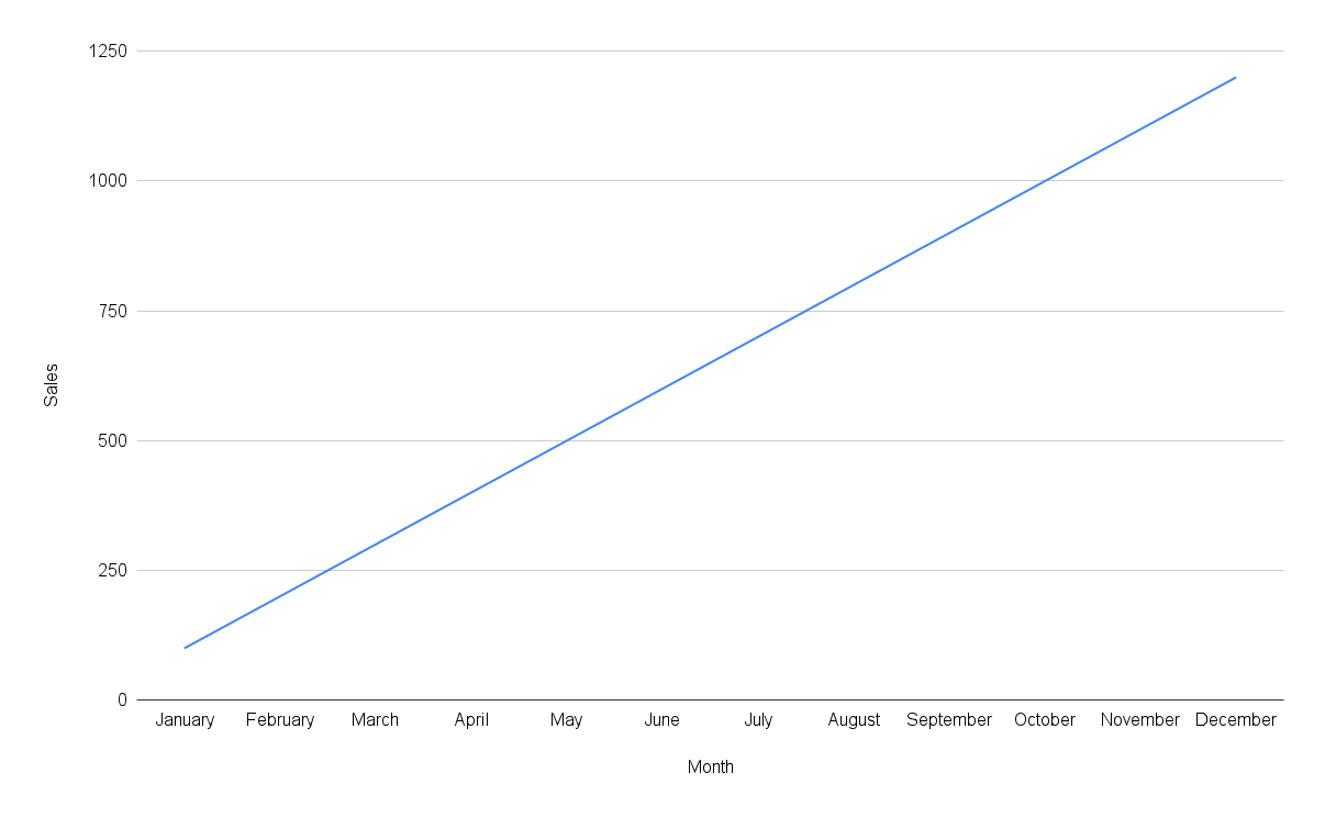
Graphs with an X and Y-axis are called line graphs. Line graphs are great for showing changes over time, like how sales numbers fluctuate throughout the year.
In that example, the Y-axis would represent sales, while the X-axis would represent months.
If you have an online store, you can use a line graph to show website traffic over time. You can also add another line to show sales over time. Ideally most of your website visitors make a purchase, but a line graph will help you see the discrepancy and take steps to increase conversion rates.
In that example, the Y-axis would represent the amount of visitors, while the X-axis would represent months.